
 NBC Chicago Entertainment
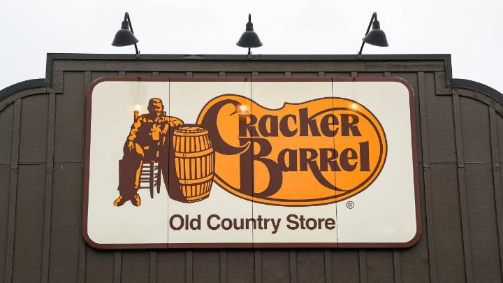
Say bye-bye to the barrel in Cracker Barrel — at least, in the logo.
On Aug. 19, in an announcement about its fall menu, the country-themed chain debuted a new logo. And for the first time in 48 years, its logo is text-only.
Cracker Barrel opened in 1969 with a text-only logo. In 1977, it updated its original logo to include the recognizable image of a man resting by a barrel. The brand says the new logo “is now rooted even more closely to the iconic barrel shape and word mark that started it all.”
Cracker Barrel's old logo (left) vs. new logo (right). Cracker Barrel
In the brand’s new visual identity, it kept the gold and brown tones of its old logo but modernized the typeface.
It also says its “farm fresh scrambled eggs and buttermilk biscuits” inspired the new color palette

 Daily Voice
 KNOE
KNOE LiveNOW from FOX Lifestyle
 FOX 4 News Arlington
 Spectrum News Louisville
 KRGV Rio Grande Valley
 WWL-TV
 Click2Houston
 KBTX News 3
 FOX 10 Phoenix National
 KICKS 105
 AlterNet