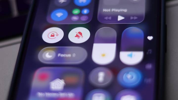
Apple's iOS 26 is here, complete with a new and divisive Liquid Glass design. Users — as usually happens when Apple drops a major visual overhaul — have a lot of thoughts.
Mixed opinions flooded the internet on Liquid Glasses' new elastic animations and semi-translucent app designs, as well as the new dark mode look (which many also struggled to toggle on and off ). Some have complained about the readability of text or feeling like screens look overcrowded, while others have leaned fully into new customization options for home screens and group chats.
Almost immediately, users took issue with a new UX choice that made using Apple's line of products (which many of us have been doing for decades now) less than intuitive: the new location of the device's search bar, which is now squarel

 Mashable Technology

 Fast Company Lifestyle
 The Washington Post Lifestyle
 Real Simple Home
 FOX News
 The Daily Mining Gazette Sports
 FOX News Videos
 The Daily Mining Gazette
 Cover Media