
 Lifehacker
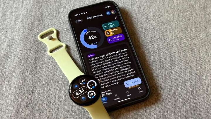
I’ve been using Fitbit’s revamped app, currently in “public preview” mode for adult Android users in the United States. While I like the simplified aesthetic, its functionality seems to center around the questionable AI that gave me so many wrong and confusing answers. Let me take you on a tour of where the new app has improved, where it’s falling short, and what’s still missing.
Better: cardio load and key metrics are easy to read
The top few metrics on the home screen have always been configurable, but I find the new version is even more readable than the old one. You get three “focus metrics” on the right hand side, and a big donut shape giving your progress toward your cardio load.
Measuring cardio load as progress toward a weekly goal is a welcome change; previously, cardio load wa

 5 On Your Side Sports
 Daily Kos
 Raw Story
 Martinsburg Journal
 CNN
CNN Oh No They Didn't
 New York Post Health