
 The Age
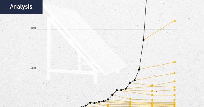
It has been called the most hopeful chart in the world , and versions of it have been kicking around in climate circles for years.
In one version, a bold black line charts a course upwards, starting on a gentle incline and then accelerating like a rocket to near vertical. This line shows the incredible speed at which renewable energy technology – mostly solar, wind and more recently, batteries – is being deployed around the world.
Points along the line mark where the world’s leading energy think tank, the International Energy Agency, has in the past predicted the renewable surge would plateau. Each year since about 2011, the IEA has been wrong and the deployment of renewables keeps surging higher and faster.
The chart, made famous by the analyst Auke Hoekstra , gives some climate ob

 People Top Story
 The Babylon Bee
 Country Living
 CBS News Politics
 AlterNet
 US Magazine Entertainment
 The Hill Video
 CNN Politics
 Essentiallysports Tennis