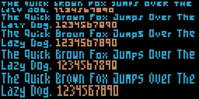
My first computer suffered an economy found in early 8-bit machines with limited video memory: if you wanted lots of colors, you got less pixels, and a rational way to do that with the hardware back then was to make pixels twice as wide. This creates weird aesthetic constraints, not least when it comes to rendering text. Fonts would be badly stretched!
Devs would avoid this by having type so tiny it was barely readable outside of UI contexts…
Or by using resolution-switching interrupts, like so, which gave up on having text in the colorful play area… 00:00/29:28 10
The Bard's Tale used anti-aliasing to try and improve legibility, but at such low resolution I'm not at all sure it works. The white on black capitals are particularly difficult.
Report Ad
Trying to find a font that is b

 Boing Boing

 America News
 Rockford Register Star
 Law & Crime
 CBS 4 News Sports
 AlterNet
 Cover Media
 The Gaston Gazette Sports
 Raw Story