
 Livemint
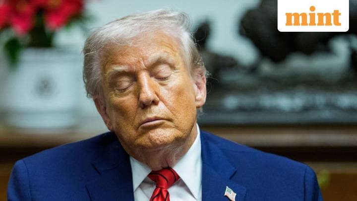
The United States government has changed its typeface again—yes, literally its typeface—and in doing so has reignited a cultural skirmish few outside graphic-design world could have predicted. With a directive that has the energy of a university registrar demanding essays in double-spaced Times New Roman, the Trump administration has officially abandoned Calibri, restoring the serif stalwart as the State Department’s mandatory voice to the world.
But as with most things in Washington, the choice of font is not just a choice of font.
In case the symbolism was unclear, an internal cable—reported by Reuters —spelled it out: the change seeks to “restore decorum and professionalism to the Department’s written work products and abolish yet another wasteful DEIA program.”
Few bureaucratic re

 Zee News English
 The Times of India
 MillenniumPost
 Ommcom News
 People Top Story
 The Fashion Spot