
 The Atlantic
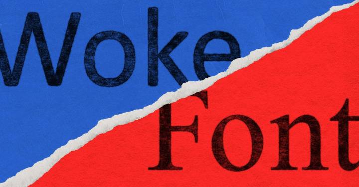
Marco Rubio here, with an important announcement: No more Calibri in official State Department communications! Get out of here with your ungarnished lines and provocatively naked terminals! The Biden administration may have shot the serif, switching from Times New Roman on the grounds that serif-less fonts such as Calibri are more accessible to readers with disabilities. That’s all over now. The State Department Action Request reads: “To restore decorum and professionalism to the Department’s written work products and abolish yet another wasteful DEIA [Diversity, Equity, Inclusion, and Accessibility] program, the Department is returning to Times New Roman as its standard typeface.” Now you can read a sentence like “Yes, the United States did just seize an oil tanker off the coast of Venezuela! Don’t worry about it,” and bask in the sense of absolute decorum that comes from seeing a little serif on all of the relevant letters.
Some further updates to our font preferences:
The Justice Department will be switching to Comic Sans because current fonts have a veneer of professionalism that feels out of place in communications written by Lindsey Halligan. Now all “fundamental misstatements of law” (a judge’s words, not ours!) will be in a font where they will feel more at home.
The Department of Transportation is switching to Goudy Old Style to fix everyone’s biggest problem with air travel: pajamasThe fonts aren’t square enough!
It will also be phasing out Clearview on road signs, on the grounds that this typeface is entirely too legible. Legibility is DEIA at work. People should struggle to read. This is also why we are dismantling the Department of Education.
Also, NASA is going to be using the logo font, where the A’s all look like upside-down V’s, for all communications, just to create an extra challenge for its already-overworked scientists. AAAAAA!
The Treasury Department will be switching to Akkadian cuneiform in honor of Ea-Nasir, our Businessman of the Month! The Trump administration shares his values. We are phasing out the penny, but one thing we’re not phasing out? Quality copper! Just buy some! And if you want to complain about it, write to us in Akkadian cuneiform!
The FBI is communicating entirely in Wingdings; this is because Kash Patel clicked something by mistake and is not actually policy.
The Department of Homeland Security is getting rid of Futura and bringing back our medieval gothic blackletter favorites with a switch to Fraktur. “What do you mean, you’re bringing our medieval fonts back? What medieval fonts? What country do you think this is?” Germany, right? 1930s, right? If not, we’re going to be very embarrassed. In general, when selecting a font or making any other kind of design choice, think, Would this look out of place on a Leni Riefenstahl film poster?
The Health and Human Services Department is switching entirely to Papyrus. Finally, a font as embarrassing and unscientific as our ideas. When you read a press release saying that vaccinations are no longer recommended, now it’ll be in a font that looks like it’s advertising tropical-drink specials or chakra alignment.
The Department of Labor will switch to handwriting. Just to create more labor.
The Department of War will not be updating its fonts at this time. Instead, it will be switching from written to verbal communications. This isn’t because we are worried that some of our orders might not be legal. It’s—call and we’ll explain. Just call. Or you can probably reach Pete Hegseth on Signal.

 Associated Press Top News
 ICE News
 Raw Story
 Reuters US Top
 KIMT News 3
 NBC News
 NBC Southern California
 The Babylon Bee
 CBS News