
 Butler Eagle
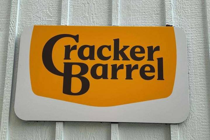
NEW YORK — Cracker Barrel is marching forward with an ongoing makeover. And to the dismay of some fans, the chain's new logo now ditches the barrel itself.
Or rather, the drawing many have associated with Cracker Barrel over the years. The man leaning on that barrel is also gone, as are the words “Old Country Store.” Instead, the new emblem features a simpler design with just “Cracker Barrel” written on a gold background, which also has a semi-updated shape.
“Anchored in Cracker Barrel’s signature gold and brown tones, the updated visuals will appear across menus and marketing collateral," the Tennessee-based company wrote in a Tuesday announcement. Cracker Barrel added that its logo is "now rooted even more closely to the iconic barrel shape and word mark that started it all.”
Accordin

 USA TODAY National
 WHAS 11
 MENZMAG
 AlterNet
 The Babylon Bee
 New York Daily News Politics
 Planet F1
 Vibe
Vibe New York Post
 Bonner County Daily Bee Lifestyle
 AmoMama
 The Daily Mining Gazette Sports