
 Daily Herald Lifestyle
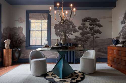
Benjamin Moore Blue Gaspe. Courtesy of Phil Mansfield
Whether it’s the ultramarine of an Yves Klein masterpiece or the faded chambray of a shirt worn soft over decades, blue sets a certain tone. A moody navy can provide a dose of quiet luxury, while a chalky powder blue emits a soft, sunlit charm. As a paint color, it’s endlessly versatile, in part because it works well with many other colors.
“I’ve never really heard anyone say, ‘I don’t like blue,’” says Mark D. Sikes, a designer in Los Angeles who has become something of a design diplomat for the hue. But beware — the wrong tone can skew “baby’s room” fast.
“People are afraid of saturated colors, which is really silly, so they tend to go too light — and that winds up being a little bit ‘nursery,’” says Jess Knauf, a designer in Denv

 Real Simple Home
 Tom's Guide
 FOX 13 Seattle Politics
 AlterNet
 The Spectator
 Raw Story
 Bored Panda
 IndyStarSports
 WFMJ-TV Entertainment
 The Monroe News