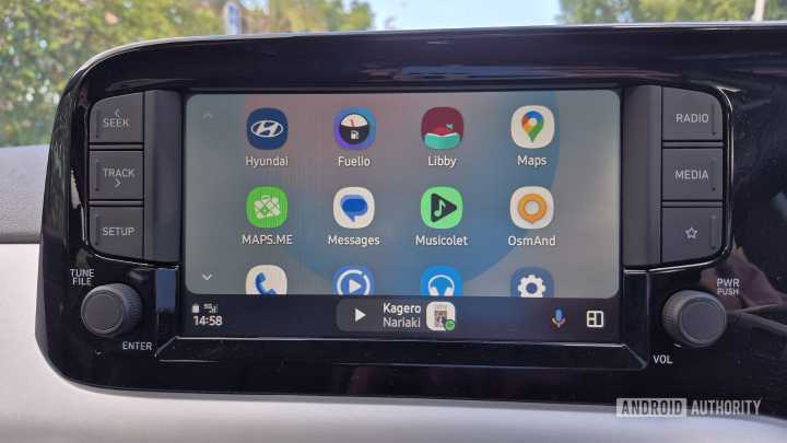
In early August, more users received Google’s updated music player redesign for Android Auto. Many questioned why core elements were altered without any functional purpose. The album art box was made smaller, the seek bar was thinned and narrowed, important text was compressed, and the background was no longer drawn from the art. Thankfully, I haven’t received this UI update yet, but I already dislike it. It made me realize an important Android Auto issue: its user interface and user experience suffer with each change Google rolls out.
Google’s design goal for Android Auto, at least as stated in its marketing material, is to keep drivers “focused on the road.” But what does this really mean? As a driver, a functional, human-centric, practical, and reliable interface would foster focus in

 Android Authority

 Reuters US Business
 Santa Maria Times Local
 PC World
 Fast Company Technology
 Associated Press US News
 The Motley Fool
 KNAU
KNAU Gainesville Sun Sports
 RCR Wireless News
 RadarOnline