
 The Shaw Local News Opinion
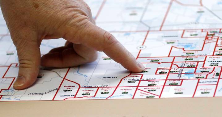
I’ve been doing a lot of thinking about maps lately.
Some of this has come through in writing, with recent columns about gerrymandering and redistricting proposals. That topic – which voters live where and how they’re grouped – leaks into other government concerns.
You’ve likely seen an Illinois map reflecting the recent presidential election with 14 counties shaded blue and the other 88 in red. Land doesn’t vote, of course, people do, and it’s much harder to convey in a two-dimensional graphic the vast population discrepancies between a place like Cook County (with more than 5 million people) and Hardin County (about 3,500). Then there’s the land area rankings, with tiny Putnam County occupying just 160 square miles and the comparatively massive McLean, exceeding 1,180 – more than seven

 America News
 Reuters US Top
 Raw Story
 AlterNet
 FOX News Travel