
 Gizmodo
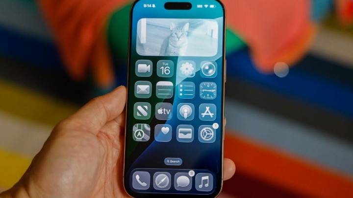
My colleagues didn’t believe me when I told them all my app icons looked slightly crooked after updating my iPhone 16 Pro to iOS 26 and getting Apple’s new Liquid Glass user interface.
I told our staff reporter Kyle Barr—an all-round consumer tech guru, mind you—to look at my home screen and tell me that my icons were tilting slightly to the left, like the Leaning Tower of Pisa. “I don’t see it,” he said, trying to convince me there was no slanting. He checked his own newly updated iPhone 14 Pro and didn’t see any tilted icons, either.
Turns out we are both correct.
To create the effect of glass and all of its reflective and shimmering properties, iOS 26 forces every icon on your iPhone home screen to have a slight glow to them in the top left and lower right corners. This gives the

 The Verge
 Roll Call
 CNN Business
 FOX 4 News Arlington
 Aurora Sentinel Opinion
 Axios
Axios Raw Story
 New York Post Video