
 Android Central
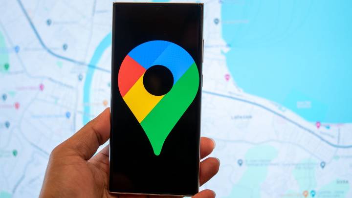
What you need to know • Google is reportedly working on a gradient color redesign for its app icons for Maps and Photos. • While the Photos' app change is more minimalistic, it seems that the individual petals are a little wider. • The Maps icon sees a bigger change, as it appears a little more stout, and as it adopts that seamless blend between hues.
Enjoy our content? Make sure to set Android Central as a preferred source in Google Search, and find out why you should so that you can stay up-to-date on the latest news, reviews, features, and more.
Google's doing a little house cleaning as we get into fall, revamping the icons of apps you might reach for daily.
Google has been rocking its four-color classic (red, blue, green, and yellow), but that's undergone some small, more mode

 The Register
 The Babylon Bee
 Tribune Chronicle Sports
 Elle
Elle AlterNet
 Cover Media