
 KSL NewsRadio
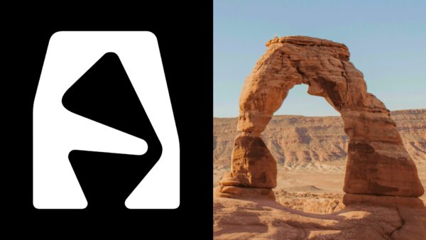
SALT LAKE CITY — In a moment inside the Salt Lake City International Airport last week, a crowd gathered to witness the unveiling of the Utah 2034 Olympic and Paralympic branding and logo . Cheers echoed in the airport foyer.
Online, however, the reaction was different.
Images of the logo quickly spread across social media and message boards, where many people voiced frustration, confusion, or flat-out distaste for the branding.
Many comments said the wordmark, or font, of the logo was difficult to read.
Others felt it didn’t represent the feeling of the Olympics.
Many questioned the look of the logo.
But according to Molly Mazzolini, the creative designer behind the Utah 2034 branding, there is more meaning in the design than many people might notice at first.
“Designing a logo is,

 AlterNet
 The Daily Beast
 America News
 CNN
CNN NBC10 Philadelphia Sports
 The Babylon Bee
 Voice of Alexandria Sports
 RadarOnline