
 93 WIBC Indianapolis
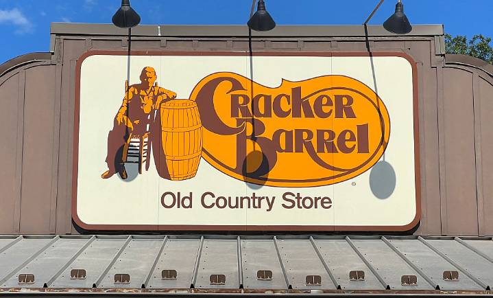
No one likes change, especially when it comes to nostalgia and food.
Cracker Barrel’s rebrand was announced earlier this week and boy, are people feeling a certain way.
In an effort to refresh their brand, Cracker Barrel revealed a new logo. The original logo with a sweet old man leaning next to a barrel against the homey Cracker Barrel font is no more. Grandpa is out and ‘clean modern aesthetic’ is in. All that remains of the restaurant’s logo is the golden-yellow backdrop and the name “Cracker Barrel” with a ‘fresh’ new font.
The logo alone has upset the internet, but the additional announcement of remodeling the inside of the ‘old country store’ is the nail in the coffin.
The campaign, “All the More,” is what is inspiring the restaurant to replace the rustic, antique-filled wall atm

 Observer News Enterprise
 FOX News Food
 Jacksonville Daily Record
 AZ BIG Media Lifestyle
 East Idaho News
 The Tennessean
 The Takeout
 People Food
 Essentiallysports Combat Sports
 Raw Story