
 West Kentucky Star
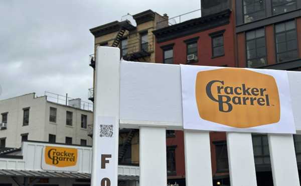
Cracker Barrel is marching forward with an ongoing makeover. And to the dismay of some fans and customers, the chain’s new logo appears to ditch the barrel itself.
The new emblem features a simpler design with just “Cracker Barrel” written on a gold background, which also has a semi-updated shape. The drawing many have associated with Cracker Barrel over the years, with a man leaning on that barrel is gone, as are the words “Old Country Store.”
“Anchored in Cracker Barrel’s signature gold and brown tones, the updated visuals will appear across menus and marketing collateral,” the Tennessee-based company wrote last week. According to Cracker Barrel, this latest look marks the brand’s “fifth evolution” of its logo to date.
Cracker Barrel has been working on a wider rebrand overhaul last y

 News Radio 690 KTSM
 USA TODAY National
 AZ BIG Media Lifestyle
 KICKS 105
 East Idaho News
 Nola Entertainment
 Observer News Enterprise
 CBS News
 Bonner County Daily Bee Lifestyle
 Martinsburg Journal
 New York Post
 Raw Story