
 WTHR
WTHR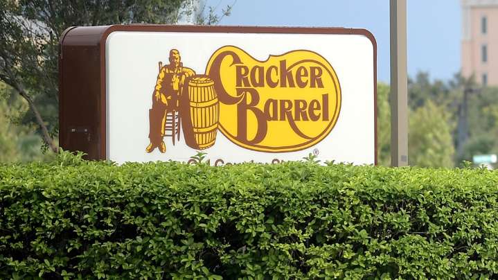
WASHINGTON — Cracker Barrel has apologized to fans for their new logo's rollout, which was criticized by many as bland and uninspired.
The Tennessee-based chain recently unveiled a streamlined, text-only logo in its first change since 1977. The brand removed its decorative script and signature image of “Old Timer,” a man seated by a barrel.
The change, which the company described as being “rooted even more closely to the iconic barrel shape and word mark that started it all,” comes alongside restaurant remodels and a refreshed color palette inspired by the restaurant’s staples like “farm fresh scrambled eggs and buttermilk biscuits.”
The rebrand is part of a broader modernization effort as Cracker Barrel faces stiff competition in the family dining market and seeks to attract younger di

 Democrat and Chronicle
 The Washington Post
 Bonner County Daily Bee Lifestyle
 The Advocate
 Daily Freeman
 The Shaw Local News Sports
 Essentiallysports College Sports
 People Human Interest
 The radio station 99.5 The Apple
 Nashville Post
 New York Post