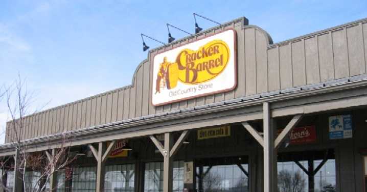
Somewhere, in a conference room adorned with reclaimed barnwood paneling ordered in bulk from a supplier in Shanghai, a well-compensated executive must have declared: For the sake of relevance, we must redesign the Cracker Barrel logo. On and on this executive rambles about “modernity,” “Gen Z, “TikTok,” or whatever corporate buzzword is in fashion now.
The precise sin of the old logo escapes me. Perhaps the gentleman in the rocking chair was deemed insufficiently dynamic, too much at leisure in a culture where every American must be depicted jogging toward a yoga class with a cup the size of a fire extinguisher. What we know for certain is that the new emblem, stripped of all eccentricity, is so algorithmically bland it might as well be advertising a Hampton Inn continental breakfast – w

 1819 News

 AZ BIG Media Lifestyle
 KICKS 105
 East Idaho News
 Nola Entertainment
 Observer News Enterprise
 CBS News
 Bonner County Daily Bee Lifestyle
 Martinsburg Journal
 New York Post
 Raw Story