
 People Food
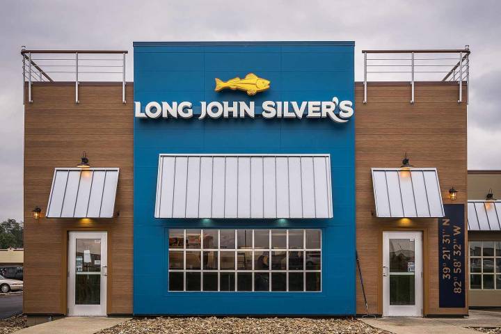
NEED TO KNOW
Long John Silver's changed its seafood-focused logo on Oct. 3
The new emblem is meant to highlight the restaurant's non-fish menu items
Despite the change, the brand promises that its seafood options are not going anywhere
A historically seafood-focused chain is moving from surf to turf.
Over the weekend, Long John Silver’s unveiled its brand-new logo that is meant to spotlight the restaurant’s non-fish menu items. The new logo swaps a fish illustration for an image of a chicken and new “Chicken + Seafood” text.
The fast food spot was formerly known for its fried fish platters but the redesign serves to highlight the chain’s chicken strips — it’s “best-kept secret,” according to a press release, which notes the change is "unexpected."
The fried white meat chicken piec

 KXAN News
 KTLA
KTLA NewsNation Business
 Taste of Home Recipes
 WMTV NBC15
 FOX 5 Atlanta Crime
 The Takeout
 The Baltimore Sun
 Detroit News
 FOX News Food
 Tulsa World
 Ocala Star-Banner
 NPR
NPR