
 cleveland.com
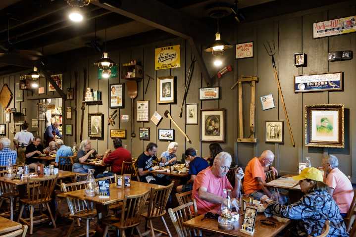
Cracker Barrel is facing scrutiny after replacing its longtime barrel-and-man logo with a controversial simplified, text-only mark as part of its “All the More” campaign, CNN reported .
Executives say the new logo is the fifth evolution in the brand’s history, staying true to its golden-brown palette. It leans more heavily on the original barrel wordmark, Cracker Barrel said in a news release . The refresh comes as the 55-year-old company seeks to balance nostalgia with a more contemporary aesthetic in its nearly 660 restaurants nationwide.
According to The Daily Beast , the logo redesign has sparked controversy, particularly among conservative groups, due to its departure from the brand’s traditional image.
The original logo, introduced in 1977, featured a man sitting on a barrel,

 USA TODAY National
 WHAS 11
 Boston.com US
 New York Post
 Daily Voice
 Aurora Sentinel
 NBC Bay Area Dixon News
 NBC 6 South Florida Entertainment
 AlterNet
 Deadline Business