
 FOX 10 Phoenix National
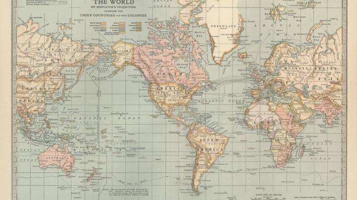
The Brief
On most world maps, Greenland and Africa look about the same size. In reality, Africa is so large that at least 14 Greenlands could fit inside it.
That distortion, common on the widely used Mercator projection, is driving a campaign led by African advocacy groups and now backed by the African Union. Supporters say the way Africa is shown on maps affects how the world sees the continent of more than 1.4 billion people.
The backstory:
The Mercator map was created in the 16th century by Flemish cartographer Gerardus Mercator. It was designed to help sailors maintain straight-line courses at sea, but it also distorted the scale of landmasses — inflating areas near the poles and shrinking regions closer to the equator.
That means continents such as Africa and South America appear

 Newsday
 Chicago Tribune
 KPTV Fox 12 Oregon
 Orlando Sentinel Sports
 Newsweek Top
 Detroit News
 Raw Story
 Western Mass
 KSL Utah
 CNN Business
 KTIV Iowa News
 New York Post
 AlterNet