
 Niagara Falls Review
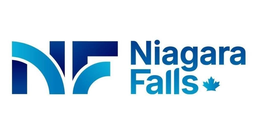
The City of Niagara Falls has unveiled a new logo, which officials describe as a fresh, contemporary look designed to reflect the municipality’s dynamic spirit and iconic natural beauty.
The rebrand was shaped by community engagement, including one-on-one interviews, a digital survey and a public open house.
The design features the initials NF, rendered in lines intended to echo the movement of cascading water, the city said in a Tuesday release.
Bright blue tones symbolizing energy and momentum to deeper aqua hues evoking creativity and depth reinforce the city’s connection to the falls, the release said. A blue maple leaf is integrated into the design.
“This fresh, modern identity reflects the vibrancy, warmth and forward-thinking energy that define today’s Niagara Falls,” said Mayor

 Toronto Star
 CBC News
 The Londoner
 Deadline
 She Knows
 People Human Interest